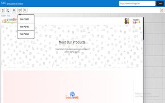
S.I.D - Simulation in Devices
S.I.D - Simulation in Devices is a responsive design checker tool available on the Chrome platform. Developed by Rajasri Systems, this free tool allows users to check the responsiveness of their websites in different screen resolutions.
With the increasing variety of devices and screen sizes, it has become crucial for websites to be responsive and adapt to different screens. S.I.D - Simulation in Devices simplifies this process by providing a user-friendly interface to test the responsiveness of websites.
The tool offers a wide range of screen resolutions to choose from, allowing users to simulate various devices such as smartphones, tablets, and desktops. By checking their website's responsiveness in different resolutions, users can ensure that their content is displayed optimally across different devices.
S.I.D - Simulation in Devices is a valuable add-on for web developers and designers who want to ensure their websites are accessible and visually appealing across multiple devices. Its easy-to-use interface and comprehensive range of screen resolutions make it a helpful tool in the development and testing process.